
Introduction
This is the second publication of a two-part Ask IFAS series. This publication is intended for social science researchers analyzing data collected using the Conceptual Content Cognitive Mapping (3CM) method. This publication introduces readers to using Anthropac software to analyze data from a structured 3CM. Topics include uploading data to Anthropac, conducting consensus analysis, creating multidimensional scaling plots, and cluster analysis.
Anthropac software for Windows can be downloaded for free at http://www.analytictech.com/anthropac/anthropac.htm.
Conceptual Content Cognitive Mapping (3CM) is a card sorting method that reveals the mental models individuals construct around specific topics. Mental models are thought maps that help people understand the world and are based on experiences, knowledge, and worldviews. 3CM is a method in which participants create a visual representation of their mental model for a given topic. The resulting visualization contains the things associated with the topic in participants’ mental models and the structure or organization of the items. Being able to see how concepts are connected in someone’s mind is a valuable aspect of this method. 3CM data can be analyzed on an individual basis, or multiple mental models from a sample can be evaluated as a group.
Cultural Domain Analysis
A cultural domain analysis (CDA) looks at how a group thinks about topics in order to understand the shared knowledge structures within their group or culture (Handwerker & Wozniak, 1997). 3CM data from a sample of people may be used for a CDA to understand how the group (or culture) thinks about a topic (domain) with as few as nine participants (Handwerker & Wozniak, 1997). Some uses of CDA are to 1) learn whether members of the sample population think about a topic similarly, 2) identify where opposing groups have different perceptions and common ground, and 3) discover knowledge gaps between experts and the sample population. For instance, when trying to encourage different groups of people to work together, it is helpful to know if the groups understand the topic in a similar or different way. Bringing similarities and differences to light early on can help establish a foundation of common understanding between groups.
This publication describes how to use Anthropac software to conduct a CDA with 3CM data. Anthropac aggregates individual mental models into a collective cognitive map by assessing how people organize the 3CM terms into clusters. Anthropac’s output includes a visual representation of how the group thinks about the topic (Albughayl & Beckford, 2023).
Real-World Applications of 3CM and CDA
The 3CM and cultural domain analysis approach has been successfully applied in a variety of real-world contexts to reveal how different groups conceptualize issues. For example, researchers used 3CM to explore how landowners and timber producers view good forest management and to identify areas of shared understanding and disagreement (Kearny et al., 1997). 3CM makes underlying mental models explicit, enabling educators or Extension professionals to design the appropriate means of communicating with differing groups. Comparing mental models also shows specific areas of misunderstanding or lack of knowledge where Extension agents can focus their efforts. Understanding the nuance of how different groups of people think of something eases difficulties that plague collaborations. In Florida, groundwater is a heavily contested issue, with farmers and environmentalists having differing views of what this resource means to them. 3CM uncovered that each group interacted with groundwater differently, yet both viewed themselves as caring for the resource. The mental models revealed that both groups share common goals — to have clean groundwater — which are a great place to begin collaboration (Hundemer & Monroe, 2020).
Analyzing 3CM Data with Anthropac
The instructions provided here are intended to be used with data from a structured (close-ended) 3CM.
Materials
A Windows computer with Anthropac software installed. The software is available for free download at Analytic Technologies.
- Data from a structured 3CM.
- A blank .txt file.
Step-by-Step Guide
Step 1: Prepare .txt Data File
This step involves transforming the data from the 3CM activity into a format that can be imported into Anthropac. The data must be typed into a .txt file before being uploaded. A template is provided in Box 1 below.
Write the terms in a numbered list to assign a number that represents each word. When entering the data for each participant, transform their terms into a numerical format. Write this list in the same order for the “labels” category to ensure consistency across participants.
Follow the template in Box 1 using your 3CM data as follows. An additional explanation is provided in Box 2.
- nm: Number of participants.
- n: Number of terms.
- matrix labels: One-word terms representing participants. You may use any one-word term such as “p1” or “sandy.”
- labels: List of all terms used in 3CM.
- data: Each participant’s matrix label followed the terms (presented in their number order) from their 3CM data. Notice that there is one line per cluster of terms.
Box 1. This example shows the example data in the required format. The text items DL nm, n, format = ps, matrix labels, labels, data, and # are standard and should not change. The entries directly after the standard text items should be modified to match your card sort data.
DL nm=14 n=57
format = ps
matrix labels:
p1, p2, p3, p4, p5, p6, p7, …p14
labels:
Hunting_Quality, US_Government, Animal_Welfare, Safety, (additional words, totaling 57 terms), Wildlife
data:
# p1
4 12 17 3
2 20 8
14 16 7 6 1 19;
# p2
2 14 16 18 19 20 6 8
1 7 15
3 4
5;
# p3
1 2 3
5 6 8 12
19 20 21;
# p20
17 14 15 18 20
3 4
2;
Box 2. Explanations of each term and variable needed in the .txt file.
DL nm=Number of participants.
n=Total number of cards. There should be one space between the “nm” and “n” values.
format = ps
matrix labels:
Assign labels to participants, then list them here with a comma and a space after each. This should be as many labels as the number for “nm.”
labels:
List all card terms. Card names cannot contain blanks. The number of card names should equal the number for “n.” Separate with a comma followed by a space. Do not use a comma after the final card. Anthropac will assign a number to each card based on its order in this list. So, Hunting_Quality will be 1, US_Government will be 2, and so on until 57.
data:
# Type the # sign followed by a space and then the matrix label assigned to that participant.
In the next line, list the numbers that represent the cards in the first group.
In the next line, list the numbers that represent the cards of the second group.
Continue until all groups are written on their own line. Use a separate row for each card grouping. No commas between numbers. At the end of the list, mark with a semicolon (;) before proceeding to the next participant. Repeat for each participant.
Step 2: Open Anthropac and Upload the .txt File
- Open the Anthropac program, Visual Pilesorts.
- From the File menu, select Import.
- Change Files of type to Text Files (*.txt) (Figure 1).
- Select your .txt file with the formatted data. Click Open.

Figure 1. This pop-up box will appear after selecting Import. Change the file type to .txt file.
Credit: Stephanie Stoutamire, UF/IFAS - Anthropac will generate a Multidimensional Scaling (MDS) plot (Figure 2).

Credit: Stephanie Stoutamire, UF/IFAS
Note: If an error code appears, there is an error in the formatting of the .txt file. Reopen the .txt file to ensure commas, spaces, and semicolons are entered as illustrated in the example above.
Step 3: Confirm Data Significance for a Cultural Domain Analysis (CDA)
Before continuing with the analysis, see whether the data represents a single culture of thought. It is only appropriate to proceed with CDA if there is a single culture of thought among participants. A single culture of thought means that, even if individuals phrase things differently, their underlying assumptions and categories align. For example, if participants all describe environmental policy in terms of “regulation, enforcement, and compliance,” this indicates a shared framework. If there is no consensus, it implies that there are significant differences in how some participants think about the topic.
- Navigate to the Anthropac toolbar at the top of the screen and select the Respondents tab.
- Choose Consensus.
- The “Your data exhibit strong fit to the consensus model, supporting an assertion that, despite individual differences, all respondents in the sample belong to a single culture with respect to this domain” message in blue (Figure 3) displays if the data is consistent with a single domain of thought. “Domain” refers to the topic of interest (e.g., proper yard care).
- A second confirmation of consensus is the eigenvalue ratio, which is displayed above the blue message. If the eigenvalue ratio is greater than 3.0, it is consistent with a single culture of thought (Borgatti, 1997).

Credit: Stephanie Stoutamire, UF/IFAS
The competence matrix (Figure 3; displayed alongside the consensus analysis) shows the Competence number associated with each participant. This value is the correlation between each participant’s mental model and the collective mental model of the group. If an individual’s competence value is low, their mental model data is substantially different than that of the group. This difference could exist because the person misunderstood the instructions during the card sort activity, or because they have a very different view of the topic.
If there are participants with low scores, researchers must decide whether to keep or discard their data. There is no set minimum correlation requirement, but other studies have removed participants with correlations less than 0.2 or 0.3. Remember that the goal of CDA is to represent the collective mental model of the overall group, not every outlier; thus, it is acceptable to remove outliers from the analysis. To remove a respondent from the CDA analysis, update the .txt file to reflect this change and upload the new version to Anthropac.
Step 4: The MDS Plot
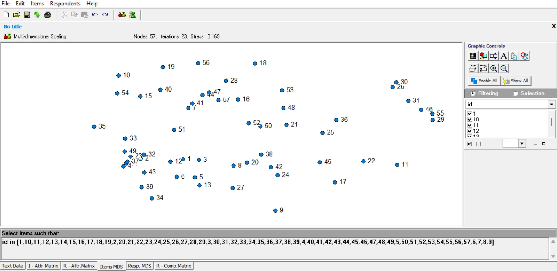
The multidimensional scaling plot (MDS) is a visual representation of the words included in respondents’ mental models. It is a visual representation of the card arrangement for the group as a whole.
After confirming the data collected is appropriate for a CDA, return to the MDS plot (Figure 2). There are two ways of accessing it.
- Across the bottom of the screen are several tabs. Select Items MDS.
- Open the Items tab at the top of the screen and select MDS.
Credit: Stephanie Stoutamire, UF/IFAS
For easier interpretation of the image, the number labels can be converted into written words.
Go to the Graphic Controls box in the top right corner.

Credit: Stephanie Stoutamire, UF/IFAS
Click on the Labels icon.

Credit: Stephanie Stoutamire, UF/IFAS
From the pop-up box, change the Attribute from id to label.

Credit: Stephanie Stoutamire, UF/IFAS
Click OK.
The image should now look like Figure 8.

Credit: Stephanie Stoutamire, UF/IFAS
On the map, some points are closer together while others are spread apart. Roughly speaking, terms that are closer together were grouped together more frequently by participants, and points further apart were infrequently grouped together. The measurable distance between points on the MDS plot is not accurately scaled, because it represents a multidimensional concept on a two-dimensional screen.
Step 5: Cluster Analysis
Clustering is a statistical method that groups similar items together based on shared patterns or relationships. In this context, it generates groupings that represent domains of thought in the group’s collective mental model.
- With the MDS displayed, navigate to the Items menu at the top of the screen and select Cluster Analysis.
- A pop-up screen will ask you to select the clustering method and the maximum number of clusters to show.

Figure 9. Close-up of Clustering Options window.
Credit: Stephanie Stoutamire, UF/IFAS - The clustering method should be set to Average link.
- For Max. clusters to show, it is suggested to start by entering the total number of terms entered in the .txt file. This is because a low number of clusters may limit options when exploring this feature.
- Click OK.
An initial cluster diagram will be displayed with one large cluster that contains all the terms, as shown in Figure 10 below. Notice the Clustering box in the bottom right corner. Use this box to explore different options for clustering. In the example below, _partition1 is selected, which results in one large cluster.

Credit: Stephanie Stoutamire, UF/IFAS
Adjusting Clusters
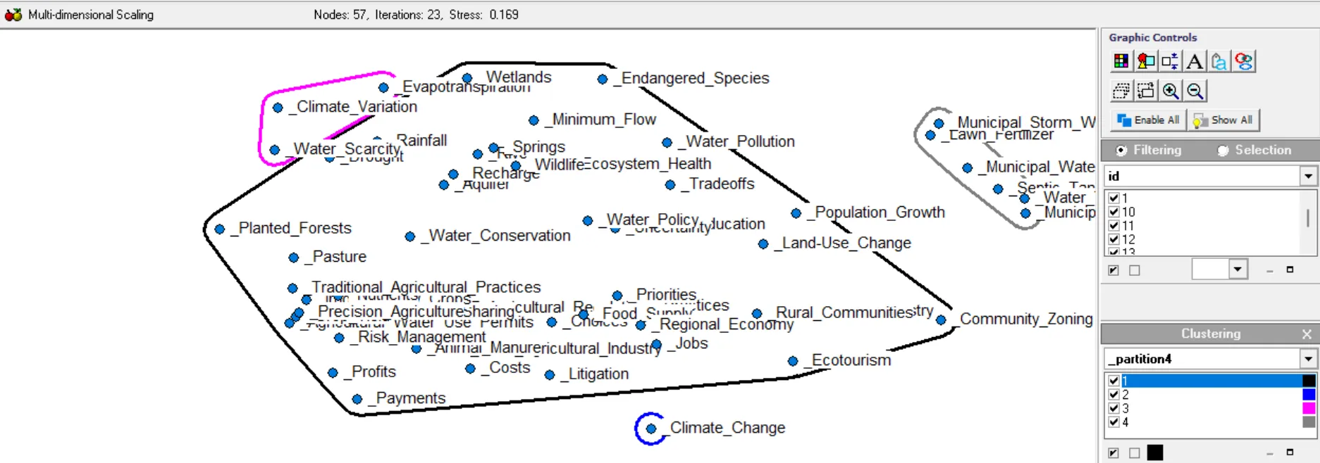
As you increase the number of partitions, Anthropac will divide the terms into the next logical split, resulting in more clusters.
- From the Clustering box, click on the drop-down arrow and select another partition. Figure 11 below has a partition of four.
- Continue adding clusters.
Credit: Stephanie Stoutamire, UF/IFAS
Deciding on the Number of Clusters
The final decision on how many clusters to set is based on the research questions and the way the researcher interprets the findings. There is no “correct” number of clusters; the best number is the number that supports interpretation. At each division, notice the differences in the words included in each cluster. The goal is to find clusters that make sense to the researcher given their knowledge of the topic and the respondents/group. Ultimately, it is up to the researcher to decide which partition number is the most interpretable given the research questions.

Credit: Stephanie Stoutamire, UF/IFAS
Final Touches
Once the number of clusters has been decided, the appearance of the map can be changed to make it easier to see the different groups. The Graphic Controls box (outlined in Figure 12) has options to adjust the appearance of the map. Changing the shape and color of the icons increases the readability of the map, especially if there are overlapping clusters.

Credit: Stephanie Stoutamire, UF/IFAS
Use the icons from the Graphics Control box (shown in Figure 13) to adjust the color (left icon) or shape (right icon) of each cluster.
A pop-up box (such as the one in Figure 14) appears when you click the shape or color button. From the drop-down menu, select the same number of partitions, or clusters in the map.

Credit: Stephanie Stoutamire, UF/IFAS

Credit: Stephanie Stoutamire, UF/IFAS
Beyond Clustering
An individual proximity matrix (IPM) can be viewed for each participant in the study. This chart displays the words each participant chose and the way the words were grouped.
To access the IPM:
- Drop down the Items tab in the toolbar.
- Select the View tab.
- Click on Individual Proximity Matrix.
- A pop-up window will appear (Figure 16) that contains all the participant IDs in the study.

Figure 16. Example Respondents pop-up window.
Credit: Stephanie Stoutamire, UF/IFAS - Highlight any participant and select OK to see their unique chart of word choices and word piles.

Credit: Stephanie Stoutamire, UF/IFAS
Each axis in the IPM contains all the terms used in the study. The number 1.000 appears any time the two intersecting terms are put in the same group by the participant. The number 0.000 is used if the terms are not grouped. The IPM values for each participant are used to calculate the aggregate proximity matrix.
Anthropac uses data from the IPM to calculate an aggregate proximity matrix (APM), which incorporates data from the entire group. The APM is similar to the IPM, but differs in the recorded values.
To access the APM:
- Drop down the Items tab found in the top left bar.
- Select the View tab.
- Click on Aggregate Proximity Matrix. Figure 18 shows the APM for our example.

Credit: Stephanie Stoutamire, UF/IFAS
In the APM, the value of intersecting terms is the percentage of participants who put the two terms together in their mental models. These percentages are used to determine distances between plot points on the MDS plot (Figures 2 and 4). Higher percentages cause the terms to be displayed closer together on the MDS plot, while lower percentages would cause terms to be further apart. In the example APM in Figure 18, 64% of respondents grouped Agricultural Best Management Practices with Agricultural Fertilizer, and only 7% grouped Agricultural Fertilizer and Climate Change.
Values appearing in blue text are found at the intersections of the same terms (in Figure 18, _Agricultural_Fertilizer, _Agricultural_Regulations, and _Agricultural_Water_Use_Permits) and are not used in calculating distances between points. The blue values record the percentage of participants who included the term anywhere in their mental model. In this example, 93% of participants included the term Agricultural Fertilizer, while 79% included Agricultural Water Use Permits.
Summary
This publication introduced readers to performing a cultural domain analysis (CDA) using Anthropac, with data collected during a 3CM activity. This free software performs statistical analyses to create an aggregate mental model that represents how a culture, group, or community thinks about a topic of interest. This can help tailor communication and outreach strategies to be effective for a target audience or even help opposing groups see a different perspective and reduce conflict.
Conclusion
This publication is part of the Mental Model series on Ask IFAS. Mental modeling is an effective card-sorting interview technique that gives social scientists insight into the minds of individuals. When using this technique in conjunction with Anthropac cultural domain analysis software, researchers can extrapolate and statistically summarize shared patterns from small samples (per CDA).
References
Albughayl, L., & Beckford, W. (2023). Chapter 18: Cultural domain analysis. In J. M. Okoko, S. Tunison, & K. D. Walker (Eds.), Varieties of qualitative research methods. Springer. https://doi.org/10.1007/978-3-031-04394-9_18
Borgatti, S. (1997). Consensus analysis. http://www.analytictech.com/borgatti/consensu.htm
Handwerker, W. P., & Wozniak, M. (1997). Sampling strategies for the collection of cultural data. Social Science Research, 26(3), 239–257.
Hundemer, S., & Monroe, M. (2020). A co-orientation analysis of producers’ and environmentalists’ mental models of water issues: Opportunities for improved communication and collaboration. Environmental Communication, 15(3). https://doi.org/10.1080/17524032.2020.1828128
Kearny, A. R., Bradley, G., Kaplan, R., and Kaplan, S. (1997). Stakeholder perspectives on appropriate forest management in the Pacific Northwest. Forest Science, 45(1), 62–73. https://doi.org/10.1093/forestscience/45.1.62